Logo design
We start from your trade, your clients and your competitors, then draw a few directions. You choose, we refine. The logo is tested large and small, in colour, in black and white, on light and dark backgrounds.
Digi4you is a visual identity agency in Walloon Brabant, in Braine-le-Château, for SMEs across the country. From logo to signage, each service can be ordered alone or as part of a full project.
We start from your trade, your clients and your competitors, then draw a few directions. You choose, we refine. The logo is tested large and small, in colour, in black and white, on light and dark backgrounds.
Colours, typefaces and usage rules gathered in one clear document: space around the logo, minimum sizes, what never to do. You, your team and your printer always know what to use.
Website, social media, business cards, stationery, email signature, signage, vehicle lettering. Every material reuses the same pieces, so your company is recognised everywhere.
Is your logo dated, has your offer changed, or do your materials no longer match? We keep what works, modernise the rest and prepare the transition across all your materials.
Your identity continues in your website design and shows in our work.
Our own logo, from the construction grid to its colours: scroll and it builds itself before your eyes. Yours follows the same path.
01 ConstructionA grid and a few circles: the shape holds before it exists.
Scroll
Scroll: our name changes weight, width and slant letter by letter, then typeface, until it finds its own.
Digi4you
Our black metal business card to handle, then the Digi4you brand printed across its materials: packaging, print, large format, shop window and website. The same pieces everywhere, to be recognised at first glance.
Move the card · tap to turn it over
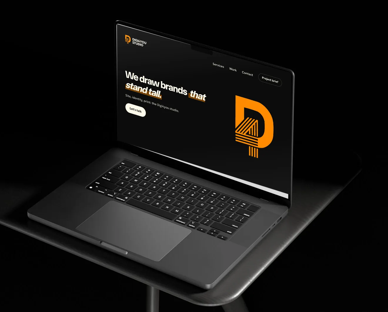
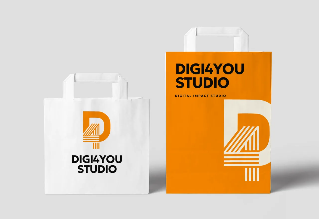
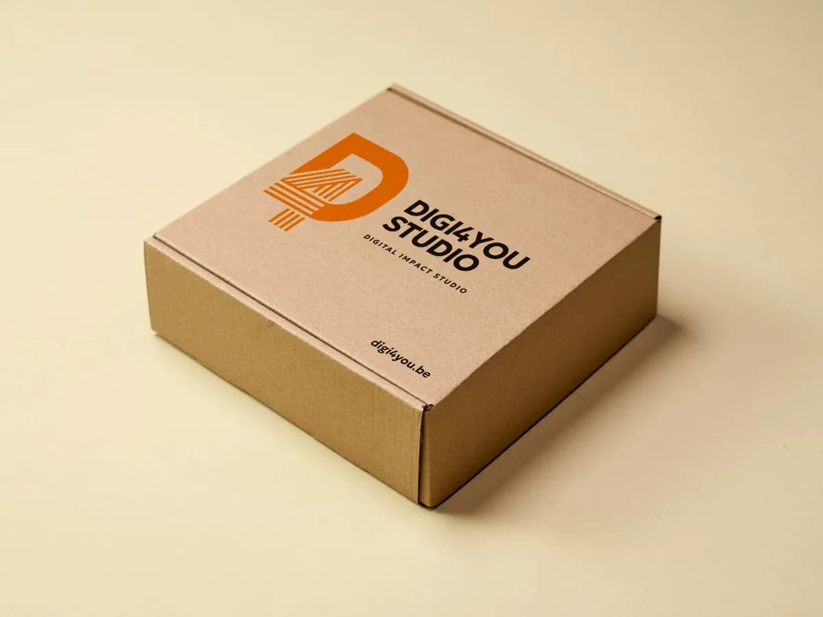
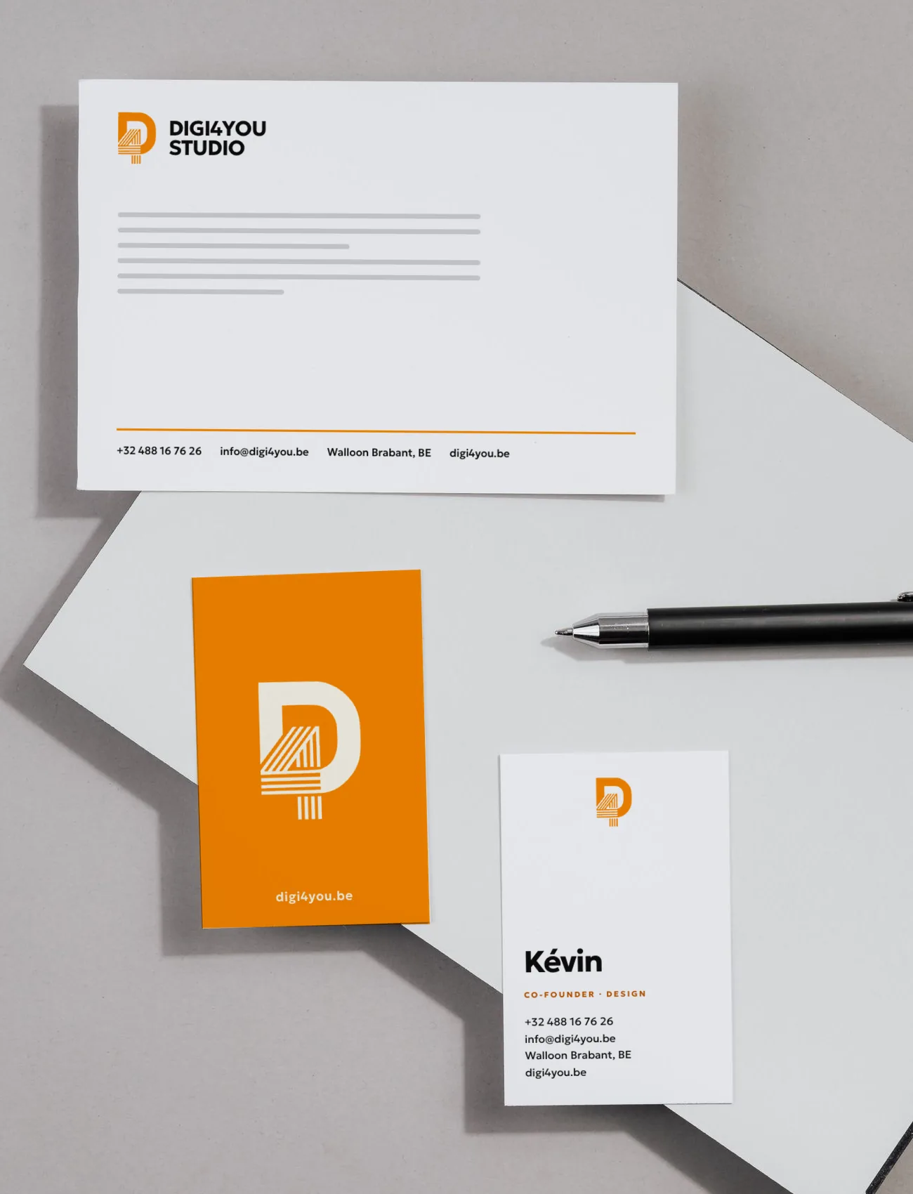
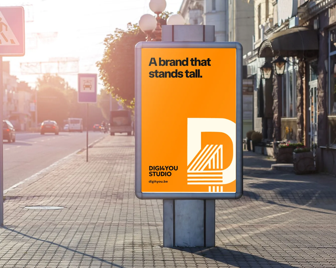
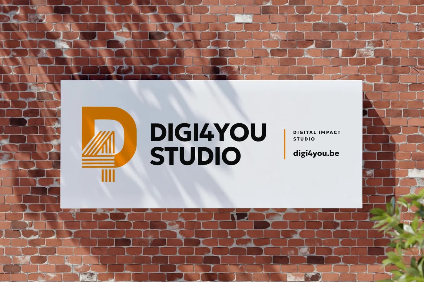
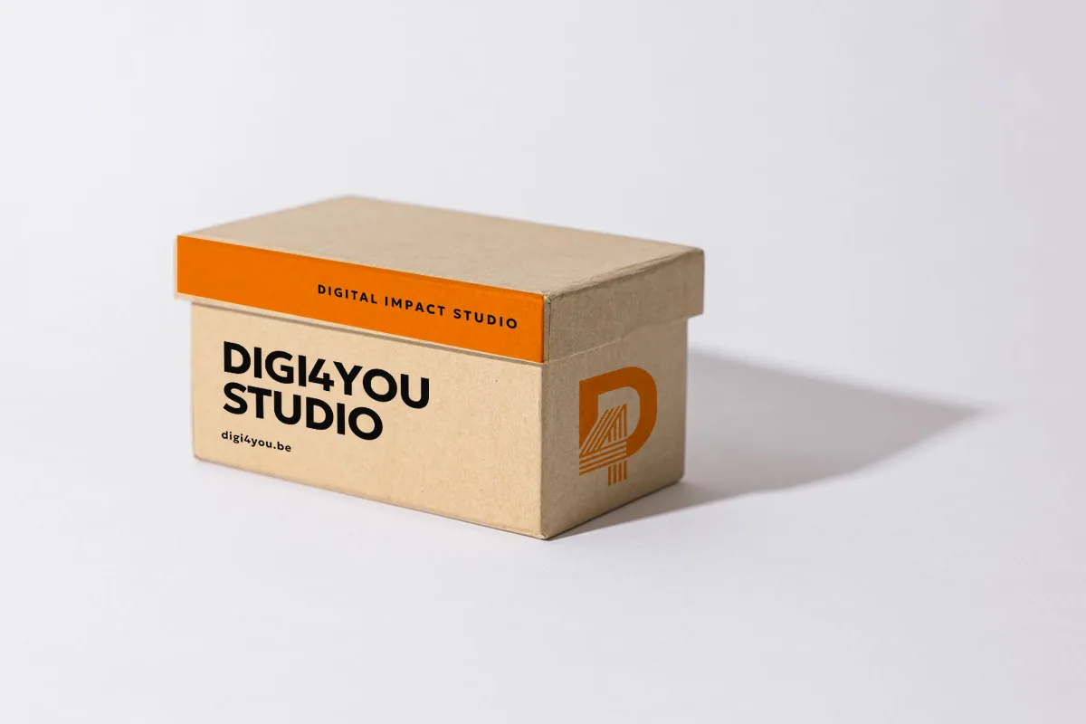
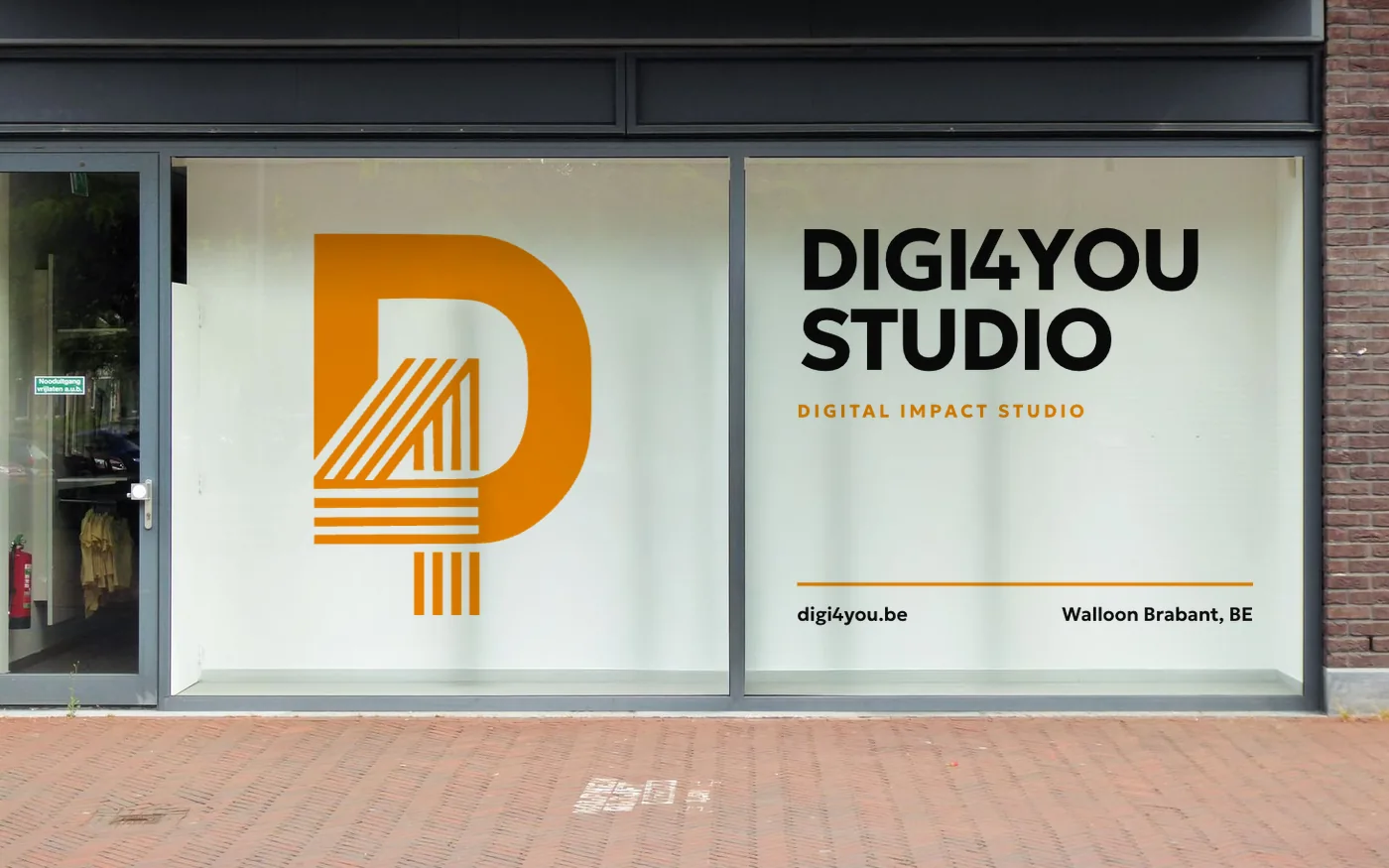
The same photo, before and after printing: drag the handle to watch the brand land on the bag, the shop window or the box.
A logo is also built for the press: each colour goes onto its own film, and everything lands in the right place on paper.
No style imposed. We frame the visual direction with you. Here are a few atmospheres we love, to start the conversation.
No useless visual noise. Every element has a precise role. If we hesitate to remove it, we probably should.
Tokens, components, usage guidelines. So you (or your next vendor) can resume the work without archaeology.
Low-fidelity mockups first, refinement after. We validate direction before investing in detail.
Cleaned files, clean exports, synthetic charter. No 800-frame messy .fig file. You leave with a kit you understand.
It depends on the scope: a logo and basic identity, or a complete identity with brand guidelines and a design system. We quote after a first conversation, free and with no commitment, and the quote details every deliverable.
The logo is your company's graphic signature. Brand guidelines set the rules: colours, typefaces, spacing, what you do and don't do with the logo. The visual identity is the whole: logo, guidelines and applications (cards, website, social media, signage).
A logo and its variants, a colour palette, typefaces, usage rules and applications across your materials. With a design system you also get a library of reusable components (buttons, forms, cards) so every new page or material stays consistent.
When your image no longer looks like your company: a new offer, a new clientele, a merger, or materials that no longer match each other. A logo that is unreadable when small or several years old is also a good signal. We tell you frankly if a simple refresh is enough.
You receive your logo files in vector form (editable without quality loss) and in ready-to-use formats for web and print, plus your brand guidelines. Files for the applications (cards, brochures, signage) are prepared for the printer. The exact list is specified in the quote.
Allow 4 to 8 weeks depending on scope. A logo with a few applications takes 3 to 4 weeks, a complete identity with design system and print 6 to 8 weeks. You get a precise schedule from the brief.
Yes, design and development are one. When we build your site, design is part of the project and not billed separately. One contact, one schedule, one coherent deliverable.
On Google Meet or over a coffee in Walloon Brabant. Pick a slot, we confirm it the same day.